Description: A practical 2025 B2B guide to content creation tips for LED holographic displays, from creative rules and export specs to testing, ROI and multi‑site deployment for retail, corporate and exhibition projects.
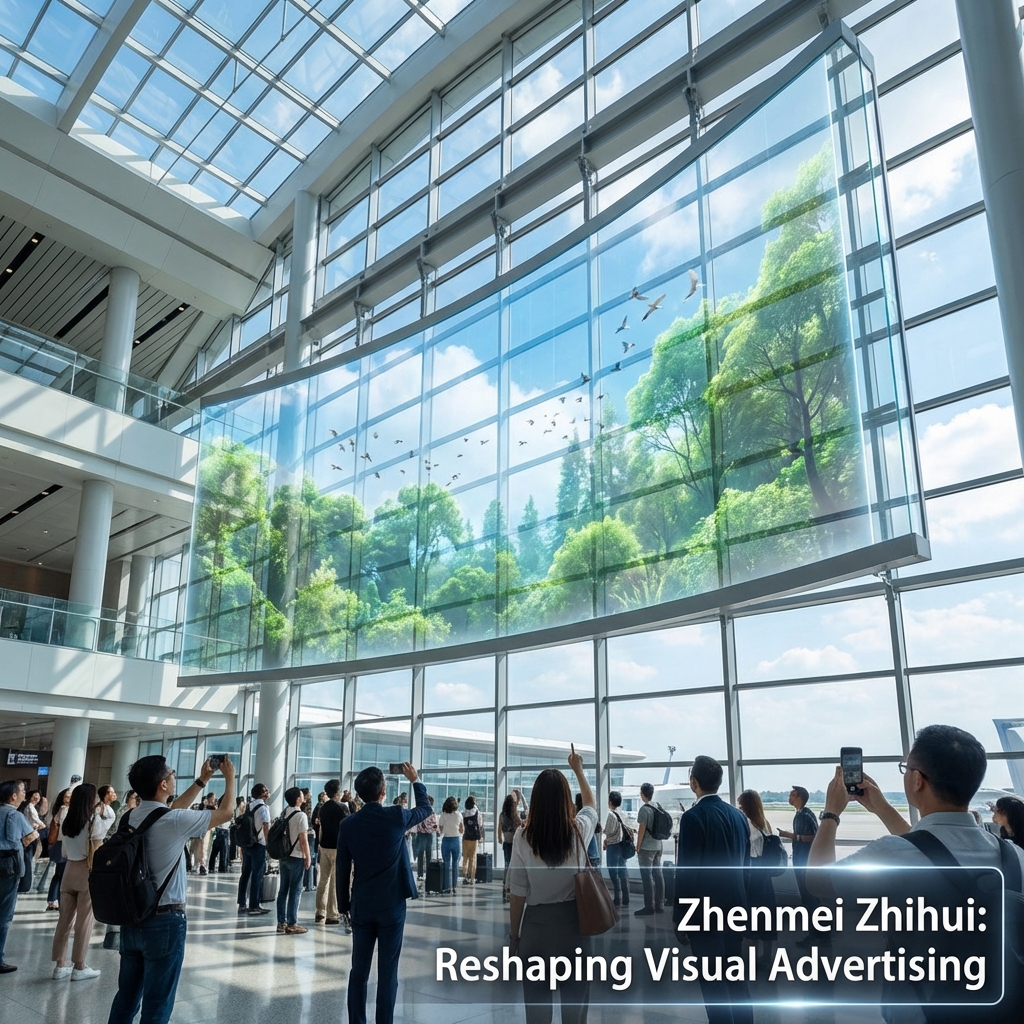
When a team calls me saying “the hologram doesn’t look holographic,” the problem is almost never the hardware; it’s the content pipeline. You can have a beautiful transparent LED mesh on a flagship store window, but if the background isn’t truly black, the message is too fine, or the loop is badly exported, it will look like a washed‑out banner instead of a floating object. In a market where digital signage is heading toward nearly USD 46 billion by 2030, and holographic displays are one of the fastest‑growing segments, nobody can afford a dead-looking hero installation. So the practical questions are very concrete: what content creation tips for LED holographic displays actually matter in the field, how do you brief agencies so they “hit spec” the first time, and how do you test and measure all this across multiple locations without turning every campaign into an experiment?
What Makes Great Content for LED Holographic Displays?
Treat black as invisible: anything close to pure black should disappear so only the subject “floats” in space.
Design with bold silhouettes, simple geometry and limited text; avoid fine lines and tiny details.
Match your render canvas to the exact pixel size and aspect ratio of the holographic LED installation.
Keep loops short (8–15 seconds per key message) with a clear focal point in the center area.
Use high contrast and glow/outline effects to keep content readable against real backgrounds and daylight.
Export with stable frame rates (usually 25–30 fps), H.264/MP4, and test on the actual controller before rollout.
Preview content composited over site photos to catch washed‑out colors, mesh visibility and edge clipping early.
Instrument campaigns with footfall, dwell time and simple CTAs (QR, promo codes) so content performance is measurable.
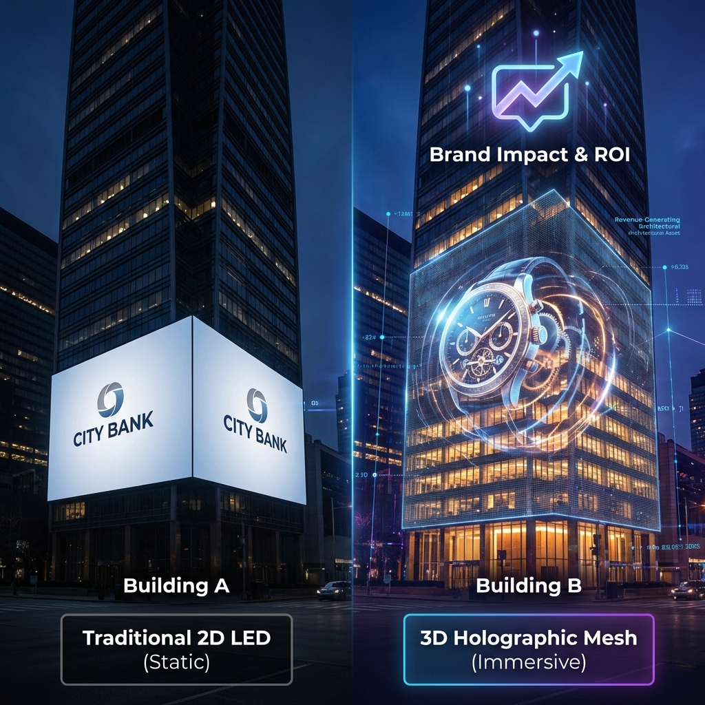
Understanding LED Holographic Displays: Principles, Hardware Types and Content Implications
How LED holographic displays work: mesh, film, fan and glass solutions in plain language
In practice, “LED holographic display” in B2B projects usually means one of four things:
Transparent LED mesh or grid on a curtain wall or atrium.
LED film or crystal film laminated on glass.
Holographic fan (LED strips spinning to form a virtual surface).
Photoelectric glass or custom transparent structures.
All of them rely on the same principle: you see bright pixels “floating” because a large part of the physical structure is optically open. On mesh or film, LEDs sit on thin strips; everything between them is see‑through. On fans, persistence of vision turns spinning LEDs into a disc. On photoelectric glass, conductors are embedded in the glass itself.
For content teams, the implication is simple but critical: you are never designing against a neutral studio backdrop. You are designing against the shopping street, the lobby furniture, or the exhibition hall behind the screen. That background can change hour by hour.
Expert view: if your content looks “okay” on a black monitor but not outstanding, it will look poor on a transparent holographic screen in real ambient light.
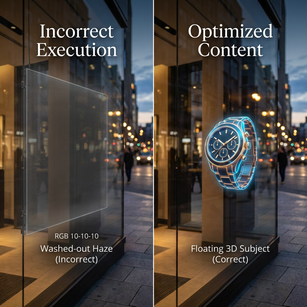
Why black behaves like invisible: transparency, contrast and background interaction
On most transparent LED and holographic systems, black pixels are effectively “off.” The viewer sees straight through to the environment. That’s why guidelines insist on “pure black background” rather than dark gray.
In real projects, a few traps show up repeatedly:
Designers export with slightly lifted blacks (e.g., RGB 10–10–10) after grading; the result is a gray haze that reveals the mesh.
Compression adds blocky artifacts in the “black” areas, again making the structure visible.
UI layers or color corrections in editing software accidentally add a subtle vignette or noise.
So:
Define black precisely in your pipeline (RGB 0–0–0, or legal range equivalent).
Test a frame on the actual LED holographic display: if the “invisible” area glows at all, fix your grading/export.
Pixel pitch, viewing distance and perceived resolution: what content teams must know
Transparent/holographic LEDs are rarely fine‑pitch. Pixel pitch of 3 mm, 5 mm, 10 mm or more is common, especially on large façades. As pitch increases, you lose detail at close distances.
A simple rule of thumb content teams can work with:
Minimum readable character height (in pixels) ≈ 2–3 × (viewing distance in meters).
So at 20 m viewing distance, plan main text at 40–60 pixels high, not 18 px.
Data point: typical LED displays have lifespans in the range of 50,000–100,000 hours before brightness drops to ~50%, so driving them at extreme brightness with large white areas not only hurts comfort, it also impacts longevity over time.
If you are working with a vendor like Zhenmei Wisdom, ask for:
Pixel pitch and cabinet resolution.
Recommended minimum viewing distance per product series.
Any safe zone or cabinet grid that might impact layout.
These numbers should directly drive your font sizes, stroke thickness and acceptable detail level.
Planning B2B Content: Objectives, Audience and KPIs Before You Open Any Software
Clarifying business goals for holographic content: awareness, footfall, dwell time, conversion
Most failed holographic content I see is visually impressive but strategically vague. Before anyone opens Blender or After Effects, write down what the installation must do:
Brand awareness: recognizable logo and product iconography, visible from far away.
Footfall: something that stops passers‑by for 2–3 seconds.
Dwell time: content that rewards staying longer (micro‑stories, product callouts).
Conversion: clear CTA pointing to a QR, store entry, or a product area.
Actionable tip: force yourself to pick one primary metric per loop (e.g., “increase entry rate by 5% during launch week”), and design around that instead of “show everything we do.”
Mapping target audiences and viewing contexts
Content creation tips for LED holographic displays only make sense when anchored to the real context:
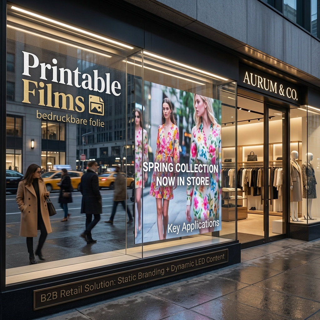
Retail window: people moving fast, often at 5–25 m distance, high daylight variability.
Lobby/atrium: slower pace, mixed vertical viewing angles, often reflective floors.
Trade show booth: crowded, noisy, many competing visuals, but highly qualified visitors.
Document:
Typical viewer path lines and speeds.
Main viewing distances and angles (e.g., escalator versus ground level).
Daily patterns: morning commuters vs evening shoppers.
Translating objectives into a content brief and measurable KPIs
A good B2B brief should include:
Business objective, primary KPI and success threshold (e.g., “+10% QR scans vs backlit poster”).
Installation specs (pixel size, pitch, brightness range, product type).
Viewing context photos and short video clips.
Brand constraints (motion rules, minimum logo size, color restrictions).
Technical constraints (supported formats, max file size, playlist length, CMS rules).
That brief becomes the contract between brand, agency and system integrator. It is also your benchmark later when you evaluate whether a loop actually worked.
Creative Fundamentals for Holographic LED Content: Composition, Depth and Storytelling
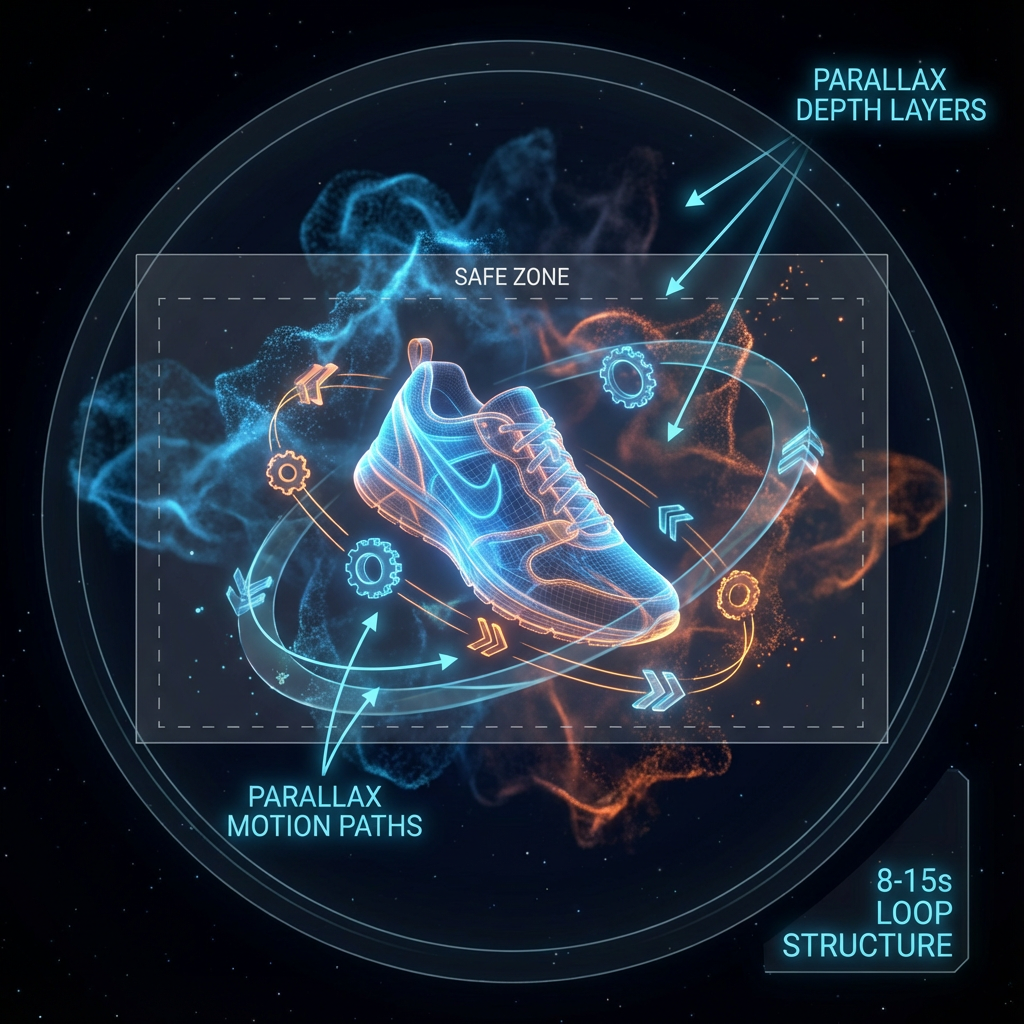
Designing for the floating illusion: silhouettes, center‑of‑frame focus and safe space around edges
On a transparent LED screen, the edges of your content are literally floating in mid‑air. Any element touching the outer boundary tends to feel “cut off” by the frame or cabinet borders.
So:
Concentrate key objects in the central 60–70% of the canvas.
Preserve a soft buffer around the frame where only small particles or subtle glow appear.
Think in silhouettes first: if you turn your frame into a pure black‑and‑white cutout, does the shape read instantly?
Simple mental check: if someone glances for 0.7 seconds from a car or escalator, can they answer “what is it?” It’s the same logic as good wayfinding, just in 3D.
Using motion, parallax and layer depth to create a convincing 3D effect
You don’t always need heavy 3D modeling to achieve a holographic feel. Well‑planned 2.5D motion is often enough:
Foreground object: product or logo.
Mid‑ground: supporting elements (text, icons).
Background: faint particles, directional light, or slow volumetric smoke.
Then:
Add gentle parallax: foreground shifts slightly faster than mid‑ground when orbiting.
Use occlusion: let small sparks pass behind the product to hint at depth.
Avoid fast, high‑frequency strobing, which can cause discomfort and flicker, especially in phone cameras.
Short loops and micro‑stories: structuring 8–15 second sequences
In retail or busy public spaces, 8–15 seconds per distinct message is a good baseline. Longer loops can work in lobbies, but they still need “entry points” every few seconds.
An effective micro‑story for a holographic LED film on a window might be:
Frame 1–3 s: product outline fades in from particles, anchored in the central area.
Frame 4–7 s: short benefit text appears in one or two beats, maybe with a simple icon.
Frame 8–10 s: CTA or brand lock‑up, then a clean transition to loop start.
Think of it as a GIF optimized for depth, not a TV commercial cut down.
Color, Contrast and Brightness Strategy for Transparent and Holographic LED Screens
Choosing color palettes that stay visible against real‑world backgrounds and daylight
Because your “background” is the real world, your palette must beat whatever sits behind the glass:
Favor saturated mid‑tones and highlights over subtle pastels.
Avoid color combinations that disappear against common materials (e.g., dark blue text over a street full of dark signage).
Use strong outlining or inner glows around key objects to keep edges clean.
Practical heuristic: if your key object is still obvious when you view the content at 10% zoom on a laptop and overlay it on a random street photo, you are in a good range.
Managing brightness and large bright areas
Overuse of full‑white areas on transparent LED causes three issues:
The hologram loses depth and becomes a glowing rectangle.
Viewers experience glare in low‑light environments.
Long‑term, it can stress LEDs and power supplies.
Aim for:
Peak brightness tuned to the environment, not always “100%.”
Small high‑brightness accents on the subject, with mid‑tones elsewhere.
Avoid full‑frame white flashes and solid bright backgrounds.
When working with a supplier, get recommended luminance ranges per scenario. A partner like Zhenmei Wisdom will typically specify brightness capabilities and suggested operating ranges for different product series and environments.
Avoiding washed‑out visuals: contrast ratios and glow techniques
Washed‑out content usually comes from:
Mid‑gray backgrounds instead of true black.
Low contrast between subject and average environment brightness.
Over‑soft gradients that melt into daylight.
Countermeasures:
Start with a black background, then design subject values roughly 3–5× brighter than the darkest real‑world background you expect.
Use edge glows or halo effects around products and text.
Add directional light so the viewer quickly feels a 3D shape, not a flat logo.
Layout, Text and Safe Zones: Making Messages Readable on Holographic LED Displays
Defining safe zones for different installations
On transparent and holographic LEDs, safe zones are not only about readability; they also help you avoid cabinet borders, structural mullions and fixing hardware.
Good practice:
Ask your integrator for a safe zone template based on the actual cabinet layout.
Keep all essential text and logos within an inner rectangle covering 60–70% of width and height.
Use the outer area only for atmosphere (particles, soft light, very subtle elements).
If you operate multiple sites, standardize one or two “LED display content safe zone templates” and reuse them across campaigns to reduce agency learning curves.
Typography for transparent screens: font weight, size, word count
Some simple ground rules:
Use bold or extra‑bold fonts; avoid thin or hairline weights.
Avoid condensed type if viewing distance is large.
Keep stroke widths generous; super‑fine strokes vanish between LEDs at longer distances.
Limit word count: 3–7 words per message is often plenty, especially on street‑facing windows.
For international deployments, remember localization: German or Arabic copy can be significantly longer than English. Design variants that can absorb 30–40% more characters without shrinking the font below readability.
Iconography and logos: simplifying for long‑distance readability
Many brand logos are designed for print or web, not transparent LED. At 15 meters and through glass reflections:
Micro‑details (fine inner lines, small ® symbols) add noise without adding recognition.
Complex photographic marks lose clarity.
Consider:
Simplified single‑color logo variants for holographic use.
Strong iconography for key features instead of dense text lists.
A hierarchy where brand mark and product silhouette are primary, descriptive copy secondary.
Technical Specifications for LED Holographic Content: Canvas, Resolution and Frame Rate
Working with exact pixel size and aspect ratio from your integrator or LED vendor
One of the most expensive mistakes is designing in 4K “because it’s safe” while the actual screen is an odd canvas like 640×1920 or 768×256.
Ask your vendor for:
Exact pixel resolution of the configured screen.
Physical dimensions and orientation.
Any rotation or cropping applied by the controller.
Then set your project canvas to that exact resolution. If you must oversample for cleaner anti‑aliasing, do so in multiples (2×) and then downscale carefully at the end.
Choosing the right render resolution and oversampling strategy
Oversampling can help when content has diagonal lines or fine curves, but keep it reasonable:
If final LED is 640×1920, you might animate at 1280×3840 and then downscale with high‑quality filtering.
Avoid exporting oversized files for playback; they’ll either be downscaled poorly in the player or fail.
Expert note: on transparent LEDs with larger pixel pitch, oversampling beyond 2× rarely yields visible benefits at real viewing distances.
Frame rate, motion cadence and avoiding judder
Inconsistent frame rates between render, player and LED refresh cause judder and flicker:
Check controller specs: many digital signage controllers are happiest at 25 or 30 fps.
Render and export at that frame rate; don’t mix multiple frame rates in one playlist.
Use motion curves that avoid ultra‑fast micro‑movements; aim for smooth, readable motion that matches human eye tracking at distance.
If you know content will be filmed frequently for social media, test a sample loop on site and adjust shutter/fps combinations to minimize moiré.
Export Settings That Work in the Real World: Formats, Codecs and Background Handling
Recommended export settings for MP4 and H.264 in holographic LED workflows
Most B2B installations today still rely on MP4 (H.264) for reliability:
Container: MP4.
Codec: H.264, High profile.
Frame rate: match controller (commonly 25 or 30 fps).
Bitrate: typically 10–30 Mbps for 1080p‑equivalent; adjust down for smaller canvases, up for larger if the player supports it.
Color space: Rec. 709 unless your vendor specifies otherwise.
Actionable tip: render a short 3–5 second test clip first, upload to the actual CMS or player, and have the integrator confirm playback quality before locking your export preset.
When to deliver alpha channel files versus pure black background videos
Some high‑end systems accept alpha (MOV with ProRes 4444 or PNG sequences), but many don’t. Black‑background MP4 remains the safest baseline.
Use alpha if: the player/LED system explicitly supports it and you need fine‑grained compositing over dynamic backgrounds or interactive layers.
Use black background if: you are driving mesh/film directly and the environment behind the screen is the “background.”
Alpha workflows often produce heavier files and stricter pipeline requirements. For most transparent mesh or film use cases, a well‑managed black background is simpler and more robust.
Bitrate, color space and file integrity checks
Before signing off:
Check for banding in gradients and halos; increase bitrate or dither if needed.
Verify color mapping: what you see on a calibrated monitor will not match the LED precisely, but gross shifts indicate wrong color space or gamut.
Run a file integrity check (CRC or at least re‑open the exported file end‑to‑end) before sending it into a CMS network.
B2B Content Workflow: From Creative Brief to Multi‑Site Deployment of Holographic Displays
Standard workflow for brands and agencies
A robust B2B workflow typically looks like:
Brief and KPI definition (with integrator input).
Static storyboard frames over site photos (to show placement and scale).
Low‑res animatic for motion timing and loop length.
First full‑quality draft on the correct canvas.
Internal brand and legal review.
Technical preflight with the LED vendor.
Final exports and packaging.
Each stage should capture comments separately: business feedback (message clarity) and technical feedback (spec compliance) are not the same.
Coordinating with LED holographic display vendors and integrators
Your LED supplier is not just a hardware provider; it’s effectively part of your content QA chain. With a company focused on transparent and holographic LEDs like Zhenmei Wisdom, use that expertise:
Share early tests and ask for feedback on brightness, contrast and mesh visibility.
Confirm limits on playlist length, max concurrent files, and any CMS dayparting capabilities.
Align installation milestones with content production milestones so you can run onsite tests before a public launch.
Content packaging and handoff
For multi‑site deployments, treat content like a software release:
Include a manifest: file names, resolutions, durations, frame rates, and target locations.
Use consistent naming conventions (projectsiteformatresolutionversion).
Provide at least one “safe mode” loop per site that you know behaves correctly under all conditions.
A downloadable spec sheet or template package—like the ones vendors commonly host on their solution pages, for example at https://en.zmleds.com/l—saves time for agencies joining mid‑project.
Scenario Playbooks: Content Creation Tips for Common LED Holographic Installations
Retail window and street‑facing glass
Challenges: strong daylight, fast moving viewers, complex street backgrounds.
Design responses:
Aggressive contrast, clean palettes, strong silhouettes.
Main message in 1–2 beats under 5 seconds.
Brightness tuned to be visible in daylight but not overpowering at night (use schedules if CMS supports it).
Avoid thin text, heavy detail, and subtle gradients that disappear at distance.
Lobby, atrium and corporate showroom
Challenges: variable viewing angles, reflective floors, slower pace but more scrutiny.
Design responses:
Longer narrative loops (20–40 seconds) with clear entry points every 5–8 seconds.
Richer 3D motion, product journeys, data visualizations.
Calmer brightness and color schemes to avoid visual fatigue for employees and visitors.
Occasional “hero moments” where the hologram pushes out into space, then returns to a neutral idle state.
Exhibition booth, museum and event stages
Challenges: high visual noise, timed live events, camera coverage.
Design responses:
Highly distinctive shapes and motion patterns so your content stands out even when partially obscured.
Clear cues or markers for live presenters (“when this element appears, step here”).
Versions optimized for filming: reduced high‑frequency patterns, tested to minimize moiré in common camera settings.
Modular loops that can be reordered for different show segments.
Testing and Calibration: Validating Holographic Content Before and After Installation
Pre‑installation testing: compositing over site photos
Before any LED is powered on, you can catch 70–80% of design problems by:
Taking high‑resolution photos and short video clips from key viewpoints.
Compositing your holographic content over them (treating black as transparent).
Checking readability, focal point, and interference with background signage or architecture.
Simple process: export a few key frames, overlay them in Photoshop or similar, and review with stakeholders in a single session.
On‑site checks: ambient light, viewing angle, color balance
Once the hardware is installed:
Test content at different times of day (morning, midday, night).
Walk the actual viewer paths and note where content disappears, glares or clips.
Adjust brightness per schedule if possible.
For multi‑panel or multi‑screen setups, check:
Synchronization across panels (no obvious frame offsets).
Color consistency and brightness uniformity after calibration.
Acceptance criteria and sign‑off checklist
Agree on acceptance criteria before launch, for example:
Text readable from agreed distance and angles.
No visible mesh or cabinet borders in “black” areas under normal viewing.
Loop length and playlist behavior match the brief.
Files play reliably for 72 hours of continuous operation without glitches.
Capture photos and short videos as documentation; they are invaluable when you troubleshoot later or replicate the setup elsewhere.
Measuring Performance and ROI of LED Holographic Content in Commercial Projects
Key metrics for holographic LED campaigns
For B2B stakeholders, the question is: did the holographic investment move the needle? Typical metrics:
Footfall: people entering the store/area during active content hours.
Dwell time: how long viewers stay within a defined viewing zone.
Engagement: QR scans, app opens, landing page visits, social posts referencing the installation.
Conversion: promo code use, product sales in the zone, meeting bookings at a booth.
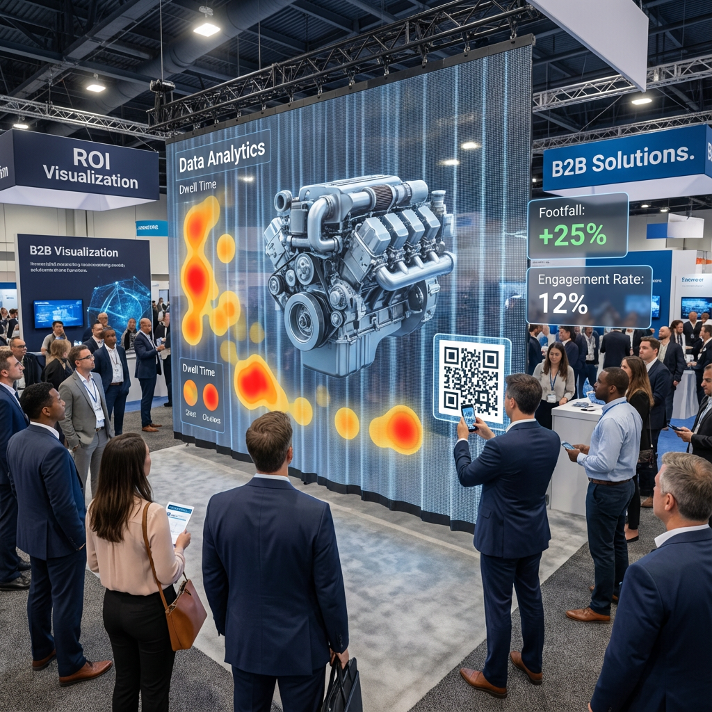
Market insight: with holographic display markets projected around USD 3.4 billion in 2024 and growing over 25% CAGR, decision‑makers increasingly expect hard numbers, not anecdotes, to justify rollouts.
Instrumenting displays with sensors and CTAs
Even simple setups can produce useful data:
Door counters or infrared beams correlated with playlist logs.
QR codes on specific content variants tagged with UTM parameters.
In exhibitions, manual counts of interactions before/after holographic content goes live.
Running A/B tests and feeding insights back into creative
Treat content like any other digital channel:
Alternate two different loops by daypart or week.
Keep all other variables stable (store promotion, staffing).
Compare KPIs and use the winning patterns (e.g., simpler silhouette, stronger CTA, specific color schemes) as standards for the next campaign.
Over time, your organization builds a practical playbook of “what works on our holographic screens,” instead of starting from zero for each new brief.
Common Mistakes, Risks and How to Fix Them in Holographic LED Content
Flat, unimpressive holograms
Typical causes:
Over‑detailed models with no clear silhouette.
Lack of motion parallax or occlusion.
Weak contrast between subject and environment.
Fixes:
Simplify geometry, exaggerate key shapes.
Add controlled orbit, camera moves and layered particles behind/around the subject.
Rework lighting and color so the subject pops against expected backgrounds.
Washed‑out, ghosting or mesh‑visible content
Typical causes:
Blacks lifted in grading or compression.
Excessive mid‑tones and gradients.
Brightness tuned for night but used in strong daylight (or vice versa).
Fixes:
Clamp blacks to true zero and use higher bitrates or gentle dithering.
Increase contrast, use glows and outlines, reduce flat mid‑gray areas.
Work with the integrator to tune brightness schedules per time of day.
Flicker, moiré and recording problems on camera
Typical causes:
Mismatched frame rate and controller refresh.
High‑frequency patterns or very thin lines.
Phone or camera shutter speeds conflicting with panel refresh.
Fixes:
Match content fps to controller; avoid complex interlaced exports.
Simplify patterns, increase stroke thickness.
Provide recommended filming settings for marketing teams (e.g., 1/60 shutter at 30 fps).
Advanced Practices: Long‑Term Content Management and Maintenance for Holographic LED Networks
Content refresh cadence, seasonal planning and localization
For networks of holographic LEDs:
Define a refresh cadence (e.g., new hero loop every 4–8 weeks; seasonal campaigns quarterly).
Maintain a core library of evergreen loops that can run safely anytime.
Plan localization windows so translation and layout fixes don’t compress timelines.
Protecting hardware lifespan with safe content policies
Create internal content policies that include:
Maximum recommended brightness for each site.
Limits on permanent static elements to reduce burn‑in risk.
Prohibited patterns (e.g., rapid strobing, high‑frequency checkerboards).
Over years, this protects both viewer comfort and the LEDs themselves.
Governance, brand compliance and accessibility
As holographic display networks grow:
Establish brand standards specific to transparent and holographic contexts.
Consider accessibility: avoid excessive flashing, maintain readable text sizes, and ensure key information is not solely color‑coded.
Define who signs off technical compliance (often in cooperation with your LED vendor) versus brand/legal compliance.
Frequently Asked Questions About LED Holographic Display Content
What types of content work best on LED holographic screens for different industries?
Retail: bold product silhouettes, limited offers, simple CTAs.
Real estate and corporate: building fly‑throughs, data or city models with slow, confident motion.
Museums and education: object reconstructions, layered explanations where depth helps understanding.
How long should a holographic content loop be for maximum impact?
For street‑facing windows, 8–15 seconds per key message is a solid baseline. In lobbies or showrooms, loops of 20–40 seconds work if they contain clear “entry points” so viewers don’t feel lost regardless of when they look up.
Do you really need full 3D models, or can 2D and 2.5D motion graphics be enough?
You don’t always need full 3D. Many of the strongest installations rely on smart 2.5D motion: layered artwork, parallax, lighting and particle effects. Full 3D is helpful when you need complex rotation or spatial storytelling but comes with higher cost and longer iteration cycles.
Conclusion and Next Steps for Your Holographic LED Content Strategy
In practice, great holographic LED content is less about “crazy 3D tricks” and more about disciplined basics: true black backgrounds, clear silhouettes, correct canvases, stable export settings and a workflow that brings your integrator into the loop early. Combine that with scenario‑specific thinking—retail window versus atrium versus booth—and you move from one‑off experiments to a repeatable content engine. As you plan your next project, walk through a simple checklist: objective and KPI defined, site photos gathered, pixel specs confirmed, safe zones mapped, test clip validated on the real hardware, and a basic measurement plan in place. Once that foundation is stable, you can decide which capabilities to build in‑house and where to lean on specialized studios or your LED partner for 3D and narrative heavy lifting, especially for flagship locations or complex multi‑screen experiences.
References
Grand View Research – Digital Signage Market Size & Forecast: www.grandviewresearch.com/industry-analysis/digital-signage-market
Global Market Insights – Holographic Display Market Report: www.gminsights.com/industry-analysis/holographic-display-market
REISSOPTO – LED Display Lifespan and Maintenance Guide: www.reissopto.com/led-faq/led-display-lifespan-and-maintenance-guide.html